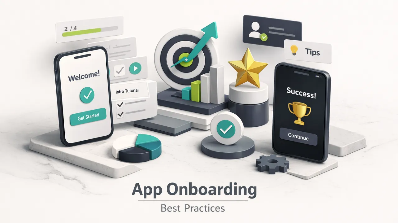
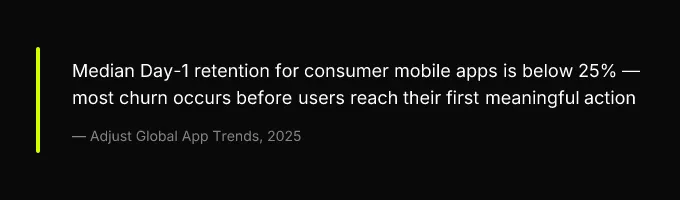
Most apps don’t lose users because the product is bad. They lose users because the first 60 seconds are bad. The median consumer app retains fewer than 25% of users by Day 1, and the majority of that churn happens before anyone reaches the feature that would have made them stay. That’s not a product problem. That’s an onboarding problem.
This guide is built for product managers, designers, and engineers who want to fix that. Not with vague advice like “show value quickly”, with copy-ready instrumentation schemas, platform-specific permission playbooks, A/B test recipes with sample sizes, and a QA checklist you can use before your next release. Everything here is designed so a cross-platform team can ship a measurable, improving onboarding flow in weeks, not quarters.
Why Most Onboarding Fails at the First Screen
The instinct when building onboarding is to explain. Here’s what our app does. Here are the five features you’ll love. Here’s a tooltip for every button. The result is a tutorial nobody asked for, sitting between the user and the thing they downloaded the app to do. And users leave, not because they’re impatient, but because you’ve given them no reason to stay yet.
Onboarding is a conversion funnel. Every screen is a step in that funnel, and every step has a drop-off rate. The goal isn’t education. The goal is getting the user to their first meaningful action, the moment where they experience enough value to come back tomorrow. Everything between the app store install and that moment is friction, and friction compounds.
Three failure modes account for the vast majority of onboarding churn. First: too much friction before value, forced signups, long carousels, and feature tours that delay the Aha moment. Second: wrong permission timing, asking for notifications, camera, or tracking consent before the user understands why they’d say yes. Third: no measurement, teams that can’t tell you their onboarding completion rate, their time to first value (TTFV), or which step loses the most users. If you can’t measure it, you can’t improve it, and you’re guessing with every redesign.
The rest of this guide addresses all three failure modes with specific, implementable solutions. You’ll get an instrumentation schema you can paste into your codebase, permission timing rules by platform, experiment templates with statistical guardrails, and a launch checklist that ties your store listing to your first-run UX.
Define Your Aha Moment Before You Design Anything
Before you sketch a single onboarding screen, you need to answer one question: what is the specific action that separates users who retain from users who don’t? This is your activation event, and it should be discovered through data, not assumed by your product team in a brainstorm. Every design decision in your first-run experience flows from this answer. Get it wrong, and you’ll build a beautiful onboarding that optimizes for the wrong outcome.
How to Find Your First Meaningful Action
The method is straightforward cohort analysis. Take your Day-7 retained users and work backward through their first session. What actions did they complete that churned users did not? You’re looking for a single event, or a small cluster of events, with the strongest correlation to retention. In a social app, it might be “followed 3 accounts.” In a productivity app, it might be “created first task.” In a B2B tool, it might be “connected first integration.”
The key distinction: this is an empirical finding, not a product aspiration. Your team might believe the Aha moment is seeing the dashboard. The data might show it’s actually inviting a teammate. Trust the data, then design the onboarding to drive users toward that specific action.
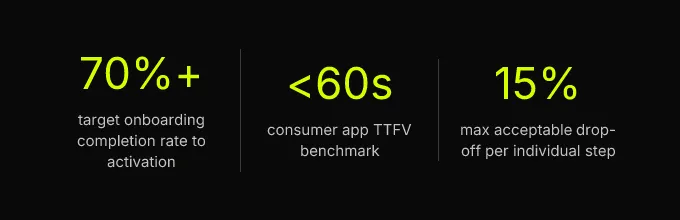
For consumer apps, the benchmark is reaching that activation event in under 60 seconds. For B2B apps, longer setup flows are justified, connecting a data source, inviting colleagues, configuring a workspace, but only when each step is a value exchange (the user gets something for completing it), not just an explanation.
Mapping the Activation Funnel by App Type
The activation event differs by category, and so does the funnel shape. Here’s how the pattern typically breaks down:
| App Type | Typical Activation Event | Target TTFV | Acceptable Onboarding Steps |
|---|---|---|---|
| Social / Community | Follow or connect with first user | < 45 seconds | 3-4 screens |
| Productivity / Utility | Create or complete first task | < 60 seconds | 3-5 screens |
| Commerce / Marketplace | Add first item to wishlist or cart | < 30 seconds | 2-3 screens |
| B2B SaaS | Invite team member or connect integration | < 5 minutes | 5-8 screens |
| ML / AI-heavy | Receive first personalized output | < 90 seconds (post-model download) | 3-5 screens + download state |
The benchmark that matters isn’t screen count, it’s completion rate. If 80% of users finish a 7-step B2B setup flow and activate, that’s better than 50% completing a 3-step consumer flow. Target above 70% completion to activation as your floor, and investigate any step where drop-off exceeds 15%.
Instrumentation Schema for TTFV and Activation
This is where most guides stop being useful. They tell you to “track activation” without specifying what to track. Here’s a concrete event instrumentation schema you can adapt to Firebase, Amplitude, Mixpanel, or any event-based analytics platform:
Event: onboarding_started
user_id(string), anonymous ID until account creationacquisition_source(string), utm_source, referral_code, or “organic”platform(string), ios, android, webapp_version(string)timestamp(ISO 8601)
Event: onboarding_step_completed
step_name(string), e.g., “welcome_screen”, “intent_selection”, “first_task_created”step_index(integer), position in the flow (1, 2, 3…)time_elapsed_ms(integer), milliseconds since onboarding_startedskipped(boolean), did the user skip this step?
Event: activation_event_reached
event_name(string), the specific Aha moment actionttfv_seconds(float), time from onboarding_started to this eventsession_number(integer), did activation happen in session 1, 2, or later?
Event: onboarding_abandoned
last_step(string), the final step completed before exitreason_code(string), “app_backgrounded”, “back_pressed”, “force_closed”, “permission_denied”time_elapsed_ms(integer)
The acquisition_source property on the start event is what enables segmentation by channel later. The reason_code on abandonment is what turns your funnel from a chart into a diagnosis. Without these properties, you know where users drop off but not why. Ship these four events before you ship your onboarding redesign, they’re the foundation for every experiment and improvement that follows.
Reducing Friction: Signup, Permissions, and Large Downloads
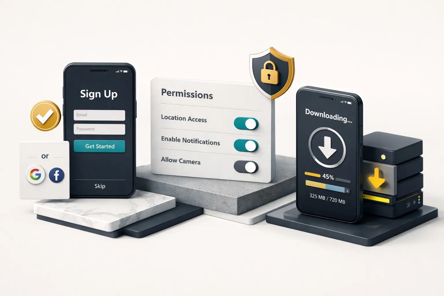
Friction in onboarding isn’t always obvious. A signup form feels standard. A permission prompt feels necessary. A 200MB model download feels unavoidable. But each of these is a gate between the user and their first meaningful action, and each one has a measurable cost. The job is to defer, reduce, or redesign each gate so it costs the user as little attention and trust as possible.
Signup Timing and Progressive Account Creation
The decision rule is simple: if the user can reach the Aha moment without an account, let them. Then prompt signup as a way to save their progress, sync across devices, or unlock a social feature, after they’ve experienced value. This is progressive account creation, and it consistently outperforms forced upfront registration.
The exceptions are apps where the core product is inherently social (messaging, multiplayer) or requires server-side state from step one (B2B tools with team workspaces). In those cases, a forced signup is justified, but it should be as lightweight as possible. Offer Sign in with Apple / Google as the primary path, with email as a fallback. Every form field you add beyond the minimum reduces your completion rate. Name? Ask later. Profile photo? Ask later. Birthday? Ask only if your product legally requires it.
Permission Timing Playbook by Platform
Permission requests are among the highest-friction moments in any onboarding flow. Get the timing wrong, and you lose the permission forever, or worse, you lose the user. The rules differ significantly between iOS and Android, and most teams treat them identically.
iOS: ATT and Pre-Permission Modals
Apple’s App Tracking Transparency prompt can only be shown once. If the user denies it, you cannot re-prompt, they have to go to Settings manually. This one-shot nature makes a pre-permission screen essential. The pre-permission modal is your own UI, shown before the system prompt, that explains in user language why you’re asking.
Sample copy that works: “We use this to show you relevant offers instead of random ads. You can change this anytime in Settings.” Compare that to what doesn’t work: “We collect your IDFA for advertising attribution purposes.” The first version frames the permission around user benefit. The second reads like a privacy policy.
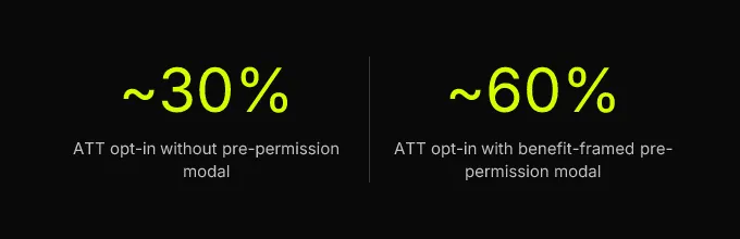
Pre-permission modals can raise ATT opt-in rates from roughly 30% to 55-60% when framed around user benefit. The modal should have two buttons: “Continue” (which triggers the system prompt) and “Not now” (which skips the system prompt entirely and lets you ask again in a future session, since you haven’t burned the one-shot system prompt yet).
For other iOS permissions (notifications, camera, location), the same principle applies: use an in-context permission request tied to the moment the user tries to use the feature that requires it. Never ask for notification permission on screen one. Ask when the user creates their first reminder, completes their first order, or takes an action where notifications would add obvious value.
Android: Runtime Permissions and Photo Picker
Android’s runtime permission model has a critical constraint: if a user denies a permission twice, the system stops showing the prompt entirely. The app can only direct the user to Settings after that. This two-strike rule means every permission request needs to count.
The playbook: ask for permissions in context, at the moment the user taps a feature that requires them. If they tap the camera button, that’s when you request camera access. If they try to share a photo, that’s when you request media access. Upfront permission screens that batch-request camera, microphone, location, and storage on the first launch consistently underperform in-context requests.
For photo access specifically, Android 13+ offers the photo picker, which lets users select specific photos without granting broad READ_MEDIA_IMAGES permission. If your app only needs users to select a profile picture or upload a specific image, use the photo picker and skip the permission request entirely. It’s better UX and better privacy.
Onboarding for Large Post-Install Downloads
Apps that require on-device ML models, offline map data, media packs, or large asset bundles face a unique onboarding challenge: the user has already waited for one download (from the app store), and now you’re asking them to wait again. This is where most apps lose patience-limited users.
The UX recipe:
- Check available storage before starting. If the device doesn’t have enough space, show a clear message with the exact amount needed, don’t let the download fail silently at 90%.
- Make the download resumable. Users will background your app. The download should pick up where it left off, with a progress indicator that shows real progress, not a spinning wheel.
- Provide partial value while downloading. This is the offline-first first-run experience. If you’re downloading an AI model, show sample outputs or let the user configure preferences while the model loads. If you’re downloading map data, show a default region. The goal is to give the user something to do, an empty state with a progress bar is a countdown to abandonment.
- Set honest expectations with specific copy. “Downloading your AI model, about 2 minutes on Wi-Fi” is dramatically better than “Loading…” because it gives the user a reason to wait and a timeframe to evaluate.
The download should always be deferrable. If the user can get partial value without the full asset bundle, let them. Prompt the download again when they try to use a feature that requires it.
Personalization, Experiments, and Accessibility
Once you’ve reduced friction in the core flow, the next layer of improvement comes from tailoring the experience to who the user is, testing your assumptions rigorously, and making sure the flow works for everyone, including users with accessibility needs and users in non-English locales.
Segmenting by Acquisition Source
Users who arrive from a paid ad, an organic search, and a friend’s referral link have different expectations, different levels of trust, and different context about your product. Treating them identically wastes the information you already have.
The implementation is lightweight: pass utm_source or referral_code into the first-run experience (most deep link SDKs handle this), then branch on three buckets with different welcome copy:
Paid acquisition: The user saw a specific ad promise. Your first screen should echo that promise. Sample copy: “You’re here for [specific feature from ad]. Let’s get you set up in 30 seconds.”
Organic: The user found you through search or browsing. They have high intent but no prior brand exposure. Lead with credibility. Sample copy: “[X] teams use [App] to [core value prop]. Here’s how it works.”
Referral: The user already has social proof from the person who referred them. Lead with the action the referrer took. Sample copy: “[Referrer name] invited you to [workspace/group/project]. Jump in.”
This kind of user segmentation doesn’t require a complex personalization engine. It’s a conditional branch on a single string property. But it can meaningfully improve activation rates because it reduces the cognitive gap between what the user expected and what they see.
For lightweight AI personalization, a short intent-selection screen (2-3 choices like “I want to track habits,” “I want to plan meals,” “I want to log workouts”) can feed a simple recommendation model or prompt template that personalizes the first content suggestion. The intent signal can be processed on-device or anonymized before any LLM call, you don’t need to store sensitive personal data to personalize effectively. Studios like CompletApp integrate OpenAI or Claude into onboarding flows this way: functional personalization that shapes the first experience, not cosmetic features bolted on after the fact.
A/B Test Recipes for Onboarding
Running experiments on onboarding is high-leverage because small changes affect every new user. But most teams either don’t test (they redesign the whole flow and hope) or test without statistical rigor (they declare a winner after 200 users). Here are three ready-to-run experiments with the structure you need:
Experiment 1: Pre-permission modal copy
- Hypothesis: Benefit-framed copy (“see relevant offers”) raises ATT opt-in rate vs. feature-framed copy (“help us improve ads”).
- Primary metric:
permission_grantedrate - Required sample: ~500 users per variant for 80% statistical power at a 10% minimum detectable effect (MDE)
- Duration estimate: 1-2 weeks for most apps with 500+ weekly installs
Experiment 2: Signup gate timing
- Hypothesis: Deferring account creation until after the first meaningful action raises the
activation_event_reachedrate. - Primary metric: TTFV (seconds) and activation rate
- Required sample: ~1,000 users per variant (activation rate changes tend to be smaller, requiring larger samples)
- Watch metric: Day-7 retention, to ensure deferred signup doesn’t create “ghost” users who activate but never return
Experiment 3: Step count reduction
- Hypothesis: Removing one explanatory screen raises
onboarding_completedrate without reducing activation. - Primary metric: Completion funnel drop-off at the removed step
- Required sample: ~800 per variant
- Guard rail: Activation rate must not decrease by more than 2%
Prioritize experiments using ICE scoring adapted for mobile: Impact (how many users does this step affect?), Confidence (how strong is the qualitative or quantitative signal that this is broken?), Ease (can you ship the variant in under a week?). The experiment that affects the most users, at the highest-drop-off step, with the simplest implementation change, runs first.
| Item | Value |
|---|---|
| Pre-permission copy test n | 500/variant |
| Signup timing test n | 1000/variant |
| Step reduction test n | 800/variant |
Accessibility and Localization Checklist
Accessibility failures in onboarding are disproportionately expensive. A contrast issue on a settings screen is a problem. A contrast issue on your onboarding screen blocks a user from ever reaching your product. Here’s the checklist, with specific test cases:
| Requirement | iOS Spec | Android Spec | Test Case |
|---|---|---|---|
| Minimum tap target | 44×44 pt | 48×48 dp | Measure every button and interactive element on each onboarding screen |
| Color contrast ratio | ≥ 4.5:1 | ≥ 4.5:1 | Run every onboarding screen through a contrast checker (e.g., Colour Contrast Analyser) |
| Dynamic type / font scaling | Support up to AX5 | Support up to 200% font scale | Set device to largest text size; verify no text clips, overlaps, or gets cut off |
| Screen reader traversal | VoiceOver | TalkBack | Navigate every onboarding screen with the screen reader; verify logical order, all elements labeled, no dead ends |
| RTL layout | Leading/trailing constraints | Start/end instead of left/right | Switch device to Arabic or Hebrew; verify layout mirrors correctly and no text overlaps |
| Locale-aware formatting | NSNumberFormatter | NumberFormat / DateFormat | Verify dates, numbers, and currency display correctly in at least one non-English locale |
Run through every row before each release. If you’re building with Flutter or React Native, test on both platforms, cross-platform frameworks handle accessibility differently on each OS, and assumptions about automatic support are the most common source of accessibility regressions in onboarding.
Ship It: Your Pre-Launch Onboarding Checklist
Before you release your onboarding flow, or any significant update to it, run through this checklist. It ties together store listing, first-run UX, privacy disclosures, and telemetry into a single pass/fail gate:
- Store screenshot parity: App Store and Play Store screenshots match the actual first-run experience. If the screenshots show a feature tour that no longer exists, users arrive with wrong expectations.
- Privacy disclosures: iOS App Privacy nutrition label and Android Data Safety section accurately reflect all data collected during onboarding, including analytics events, device identifiers, and any intent-selection data.
- Instrumentation verification: All four core events (
onboarding_started,onboarding_step_completed,activation_event_reached,onboarding_abandoned) are firing and appearing in your analytics dashboard. Verify with a real device, not just the emulator. - Permission strings:
Info.plistusage descriptions andAndroidManifestpermission declarations are accurate, specific, and not over-broad. - Accessibility pass: Onboarding tested at the largest dynamic type size and with VoiceOver/TalkBack enabled. Every screen is navigable, every element is labeled.
- Localization smoke test: At least one locale beyond your default has been tested end-to-end through the onboarding flow.
Treat this checklist as a living artifact, not a one-time exercise. The teams that compound retention gains are those that run one onboarding experiment per sprint, review TTFV weekly, and treat the first-run experience as a product surface with its own roadmap, not a set-and-forget screen built during launch week.
Your concrete first action: instrument the four core events this week. Run the activation cohort analysis on your existing users. Identify the single highest-drop-off step in your current onboarding funnel. That’s where your first experiment goes. Not a redesign. Not a new framework. One experiment, on the step that’s costing you the most users, with the instrumentation in place to know whether it worked.