Most buyers shopping for a mobile app design service don’t actually know what they’re buying. That’s not an insult, it’s the reality of a market where “design” can mean anything from a freelancer handing you three Figma screens to a full product studio delivering a research-backed design system with accessibility annotations, analytics event maps, and production-ready component specs. The gap between those two outcomes is tens of thousands of dollars and months of rework.
This guide exists to make you a better buyer. By the time you finish reading, you’ll know exactly what deliverables to demand, how to spot agencies that ship polished mockups but can’t support a real developer handoff, what a mobile app design engagement should cost in 2026 with sourced benchmarks, and how to measure whether the design you paid for actually moved your retention metrics. No fluff, no “it depends” hedging. Just the procurement-grade specifics you need to write a brief, evaluate a proposal, and hold your design partner accountable.
What You’re Actually Buying
A “mobile app design service” is not one thing. It’s a stack of disciplines bundled under a single line item, and if you don’t understand the layers, you’ll sign a contract that covers three of them while assuming you’re getting all seven. The full stack includes user research, information architecture, interaction design, visual UI design, interactive prototyping, design system creation, and developer handoff. Some agencies deliver the entire stack. Many deliver only the middle three and leave you to figure out the rest.
The service model matters as much as the scope. You’re choosing between four options: design-only agencies that hand off files and walk away, full product studios that design and build (reducing handoff risk but increasing commitment), freelancers who offer flexibility and lower rates but limited capacity for complex systems, and in-house teams that give you control but require you to recruit, manage, and retain specialized talent. Each model carries a different risk profile. A startup founder with no technical co-founder faces different tradeoffs than a procurement lead at a Series B company with an existing engineering team.
The goal here isn’t to teach you how to design. It’s to make you procurement-ready, able to write a brief that gets accurate quotes, evaluate proposals against a concrete deliverables checklist, and validate whether an agency’s portfolio represents real production work or just presentation-quality screenshots.
Scope, Deliverables, and What to Demand
Every complete mobile app design engagement moves through five phases, and you need to know which ones you’re paying for. Phase one is discovery and research: user interviews, competitive audits, jobs-to-be-done analysis, and persona development. Phase two is UX design: user flows, information architecture, wireframes, and content strategy. Phase three is UI design: the visual layer including component libraries, design tokens, typography systems, color palettes, iconography, and motion specs. Phase four is prototyping: clickable interactive prototypes with annotations that simulate real user flows for usability testing. Phase five is developer handoff: the structured package of specs, tokens, and documentation that engineers need to build what was designed.
Most contract disputes happen because the buyer assumed phases one and five were included when the proposal only covered phases two through four.
Most contract disputes happen because the buyer assumed phases one and five were included when the proposal only covered phases two through four. Ask explicitly. Get each phase listed as a line item with named deliverables.
The Full Deliverables Checklist
Use this as a reference when reviewing any agency proposal. Every item below should either be included in the scope or explicitly marked as out-of-scope with a reason.
- Discovery outputs: Research synthesis document, persona cards, competitive audit matrix, jobs-to-be-done framework
- UX deliverables: User flow diagrams for all primary and secondary paths, information architecture map, wireframes (low-fidelity for validation, mid-fidelity for stakeholder review)
- UI deliverables: High-fidelity screen designs for all unique views, component library with variants, design tokens (color, spacing, typography, border radius, elevation), motion and micro-interaction specs, dark mode variants, icon set
- Prototyping: Clickable interactive prototype covering primary user flows, annotated with interaction notes for usability testing sessions
- Handoff package: Figma handoff file (or equivalent) with developer-mode enabled, exported token list, component state documentation, accessibility annotations, localization notes, analytics event map
- Testing artifacts: Usability testing plan, session recordings or summaries, design iteration log showing changes made from testing feedback
If an agency’s proposal doesn’t mention design tokens, component states, or accessibility annotations, that’s not an oversight, it’s a signal that their handoff process isn’t production-grade.
Developer Handoff in Concrete Terms
This is where most guides get vague, and it’s exactly where buyers need the most specificity. “Developer handoff” is not sending a PDF of screens to your engineering team. It’s a structured package that lets engineers build components without guessing, and it should include these specific elements:
A named token list covering every design decision that maps to code: color primitives and semantic aliases (e.g., color-primary-500 and color-button-background-default), spacing scale values, typography styles with line-height and letter-spacing, border radius values, and elevation/shadow definitions. These tokens should be exportable in formats your engineering stack can consume, JSON for React Native, Dart constants for Flutter, XML for native Android.
Component state coverage is non-negotiable. Every interactive component needs designs for its full state matrix: default, focused, pressed, disabled, error, loading, empty, and (where applicable) skeleton/placeholder. A button that only shows its default state in the design file will generate questions from engineers, and questions during development are expensive.
Localization notes should flag which text elements will expand in translation (German strings are typically 30-40% longer than English), which layouts need RTL support, and where truncation rules apply. Accessibility annotations need to specify the semantic role of each component, screen reader labels, focus order within navigation stacks, and minimum touch target sizes. Analytics event mapping should document which UI interactions trigger which tracking events, tap on onboarding CTA fires onboarding_step_completed with parameters for step number and variant, for example.

Studios like CompletApp illustrate what this bridge workflow looks like in practice: the team designs UI/UX with custom motion and interface systems before any code is written, then maps those designs directly to Flutter component specs, so the handoff isn’t a translation exercise but a direct export. That’s the standard you should be evaluating against, regardless of which agency you hire.
Platform Guidelines and Accessibility
iOS Human Interface Guidelines and Material Design 3 are not stylistic preferences. They’re platform contracts. Apps that ignore them face longer QA cycles, inconsistent user expectations, and real App Store rejection risk, Apple’s review team flags non-standard navigation patterns, incorrect use of system controls, and accessibility failures.
Your design agency should demonstrate fluency in both guideline sets and explain where they’re following platform conventions and where they’re intentionally deviating (with justification). A custom bottom sheet that doesn’t respect iOS safe areas isn’t a “design choice”, it’s a bug that your engineers will discover during implementation.
Accessibility compliance under WCAG 2.2 maps to specific mobile patterns that your design scope must cover:
- Touch target sizing (SC 2.5.8): Minimum 24×24 CSS pixels, with a recommended 44×44 points on iOS and 48×48 dp on Android for primary interactive elements
- Color contrast for dark mode (SC 1.4.3 and 1.4.11): Every color token needs contrast validation against both light and dark background variants, not just the default theme
- Focus order on native navigation stacks: Screen reader focus must follow a logical sequence through modals, bottom sheets, and nested navigation, which requires explicit annotation in the design file
- Screen reader label coverage: Every icon button, image, and non-text element needs an accessibility label specified in the design, not left for engineers to invent
Here’s what most guides won’t tell you: accessibility testing on native mobile apps requires testing on actual devices with VoiceOver (iOS) and TalkBack (Android) enabled. A design review in Figma can catch contrast and target size issues, but it cannot validate focus order, gesture conflicts, or screen reader announcement behavior. Budget for device testing as a separate line item, typically 8-16 hours for an MVP scope.
Cost Benchmarks and Timeline Reality
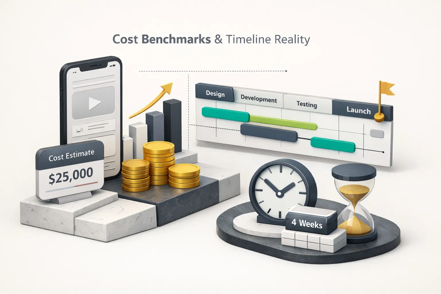
Pricing a mobile app design service in 2026 requires understanding three variables: who’s doing the work, where they’re located, and how complex your product is. Here are current benchmarks based on published rate surveys and agency pricing data as of early 2026:
| Item | Value |
|---|---|
| US Freelancer (Senior) | $125-200/hr |
| Eastern Europe Agency | $60-100/hr |
| Southeast Asia Agency | $30-60/hr |
| US Boutique Agency | $150-250/hr |
| Full Product Studio (US/EU) | $175-300/hr |
But hourly rates alone don’t tell you what your project will cost. Let’s work through two examples.
What Drives the Price
Example 1: A 5-screen MVP (onboarding, home, detail view, profile, settings). Discovery takes 20-30 hours. UX (flows and wireframes) takes 25-40 hours. UI design with a basic component library takes 40-60 hours. Interactive prototype and one round of usability testing adds 15-25 hours. Developer handoff with token export and annotations adds 15-20 hours. Total: 115-175 design hours. At a US boutique agency rate of $175/hr, that’s $20,000-$30,000. At an Eastern European agency rate of $80/hr, that’s $9,200-$14,000.
Example 2: A 30-screen SaaS app with a design system. Discovery runs 40-60 hours. UX with complex user flows and multiple user roles takes 60-100 hours. UI with a full design system, design tokens, dark mode, and motion specs takes 150-250 hours. Prototyping and two rounds of usability testing adds 30-50 hours. Handoff with full accessibility annotations and analytics mapping adds 30-50 hours. Total: 310-510 design hours. At $175/hr, that’s $54,000-$89,000.
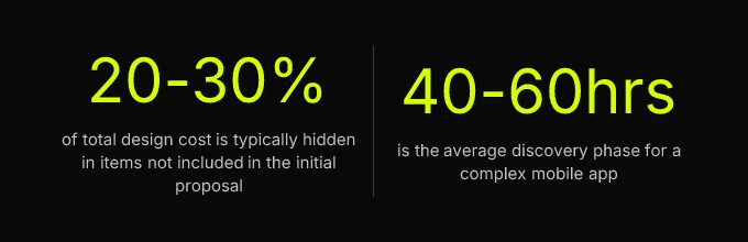
Now add the costs that buyers routinely miss. Discovery workshops with stakeholder travel or facilitation fees. Usability testing participant recruitment ($75-150 per participant, typically 5-8 participants per round). Design QA during development sprints, most agencies charge hourly for this, and it typically runs 10-20% of the original design budget. Revision rounds beyond the contractual limit (usually 2-3 rounds are included; each additional round adds 10-15% to the total). Accessibility audit fees from a third-party specialist ($3,000-$8,000 for a comprehensive native app audit).
A realistic total project cost formula: Base design fee + 20-30% for hidden costs = actual budget needed.
MVP vs. Enterprise Timelines
A lean MVP design phase, from kickoff through developer handoff, typically runs 3-6 weeks with a dedicated team. A full enterprise engagement with a design system, multiple user roles, and accessibility compliance runs 10-16 weeks. What compresses timelines: a pre-existing brand identity, clear product requirements documented before kickoff, a single decision-maker with authority to approve, and a design agency that’s worked in your industry before. What expands them: stakeholder committees requiring consensus, scope additions after UX is complete, late-stage user research findings that invalidate assumptions, and legal/compliance review cycles.
A note on AI-assisted design tools in 2026. Tools like Figma AI, Galileo, and Uizard have materially accelerated wireframing and asset generation, cutting early-phase work by 20-40% in some workflows. But they introduce tradeoffs buyers need to understand. AI-generated components often lack proper auto-layout structure and consistent token application, which means they need manual cleanup before they’re handoff-ready. Ownership of AI-generated visual assets is still legally ambiguous in some jurisdictions. And the speed advantage disappears if the agency doesn’t have a human review process to verify component quality, accessibility compliance, and token consistency. Ask every agency you evaluate: How do you use AI tools in your process, and what human review steps exist before handoff?
How to Evaluate an Agency’s Portfolio
An agency’s portfolio page is a marketing asset, not a technical proof of capability. Your job as a buyer is to look past the hero images and evaluate whether the work represents real, shipped, production-grade design, or presentation-quality mockups that never survived contact with engineers and real users.
Beyond Pretty Screenshots
Start by asking for evidence of state coverage. Open any case study and look for these screens: empty states (what does the inbox look like with zero messages?), error states (what happens when a payment fails?), loading states (skeleton screens or spinners?), and permission prompts (how does the app request camera or location access?). If the portfolio only shows the “happy path”, fully populated screens with perfect data, the agency may not have designed for the scenarios that actually determine user experience quality.
Next, ask whether the portfolio app shipped. Check the App Store and Google Play. Look at the store rating and read recent reviews. An app with a 3.2-star rating and reviews complaining about confusing navigation tells you something that the case study’s polished screenshots won’t.
Then request a design file audit. This is the single most revealing step in agency evaluation, and most buyers never do it. Ask to see a live Figma file, not an exported PDF, not a read-only prototype link. In the file, check whether components are properly nested using auto-layout, whether design tokens are applied consistently (or whether the designer hard-coded hex values everywhere), and whether the file is structured for developer handoff with clear page organization, named layers, and component documentation. A polished visual mockup with no component architecture is a strong signal that the agency designs for presentations, not for production.
Red Flags That Predict Underdelivery
These are the concrete warning signs that should make you pause before signing:
- No case studies featuring shipped products, only “concept” or “exploration” projects
- Inability to name the engineering team or developers who built from their designs
- Vague answers about accessibility compliance (“we follow best practices” with no mention of WCAG 2.2 or specific success criteria)
- No mention of design tokens or component libraries anywhere in their process description
- Proposals that skip discovery entirely and jump straight to visual design, this means they’re designing without understanding your users
- A “flat fee” proposal with no phase breakdown or deliverables list
- No process for design QA during development, they hand off and disappear
Three validation questions to ask in every agency call:
- “Can you show me the Figma file for a shipped project?”, Tests whether their work is production-structured or presentation-only.
- “How do you handle design QA once development starts?”, Tests whether they stay involved through implementation or treat handoff as the finish line.
- “What does your handoff package include, specifically?”, Tests whether they can name tokens, states, annotations, and analytics mapping without prompting. If they can’t list these specifics, they don’t deliver them.
Measuring Whether Design Actually Worked
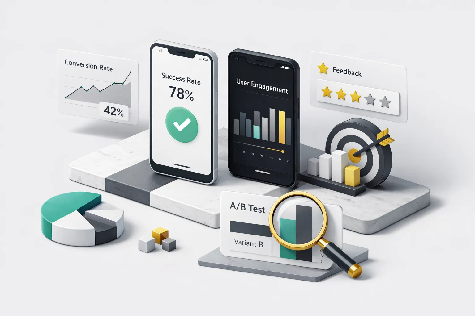
A design engagement that ends with “the stakeholders liked the mockups” has failed to prove its value. Design is an investment, and investments are measured by returns, not by subjective approval. The metrics that justify your design spend are retention rates, activation rates, task completion rates, and conversion rates. If those numbers don’t move, the design didn’t work, regardless of how good it looks.
If your design agency can’t tell you which metrics their work is intended to improve, they’re selling aesthetics, not outcomes.
This is why analytics wiring belongs in the design phase, not as an afterthought post-launch. Your design agency should define which user events map to which UI interactions and document them as part of the handoff package. Onboarding step completions, CTA taps, screen-level drop-off points, feature discovery rates, permission grant rates, all of these should be specified as named events with parameters so engineers can instrument them correctly from the first build. Most agencies leave this to the client or the engineering team after launch, which means the data is never collected consistently, and you can’t measure whether the design investment paid off.
Here’s a sample KPI framework for a post-launch design review:
| Metric | Baseline (Pre-Design) | Target | Measurement Window |
|---|---|---|---|
| Day-1 retention | Measure before redesign | +10-20% improvement | 30 days post-launch |
| Day-7 retention | Measure before redesign | +5-15% improvement | 60 days post-launch |
| Onboarding completion rate | Measure before redesign | 80%+ completion | 30 days post-launch |
| Primary action conversion rate | Measure before redesign | +15-25% improvement | 60 days post-launch |
| Accessibility-related support tickets | Count before redesign | 50%+ reduction | 90 days post-launch |
Baseline every metric before the redesign begins. Measure at 30, 60, and 90 days post-launch. If your design agency can’t tell you which metrics their work is intended to improve, they’re selling aesthetics, not outcomes.
Your Next Step as a Buyer
You now have the framework. Here’s how to use it based on your situation:
If you have a clear product concept and need a fast MVP, a full product studio with design-to-build continuity is your best option. The handoff risk drops to near zero because the same team that designs the components builds them. Studios like CompletApp operate this way, designing custom UI/UX systems and then implementing them directly in Flutter, eliminating the translation gap between design file and production code.
If you have an existing app that needs a UX overhaul to improve retention metrics, a design-only agency with a strong audit and usability testing process is the right fit. You need a team that will diagnose problems through research, not just reskin your interface.
If budget is the primary constraint, a senior freelancer with a proven handoff process and shipped products in their portfolio beats a cheap agency with no component discipline. Every time. A lower hourly rate means nothing if the output requires 40 hours of engineering cleanup.
Before you contact any agency, take one concrete action: write your project brief using the deliverables checklist from Section 2. List every phase you need, every deliverable you expect, your platform targets (iOS, Android, or both), your accessibility requirements, and your timeline constraints. A buyer who can articulate specific deliverables gets more accurate proposals, filters out underqualified vendors automatically, and negotiates from a position of knowledge rather than hope.